
I met him again at Fish & Co few months back.
As usual, I can't remember my clients' faces. Hahaha...
He was the one who asked me whether I am the artist who used to work in Clarke Quay.
I said yes, and passed him my business card.
He made an enquiry via email few weeks later. That was a caricature request, and his colleagues didn't like the idea, and thus dropped the idea.
Now, he came back with another request.
He came out with the following draft, but wanted Al Pacino to be replaced by his bosses' face, complete with the following text.
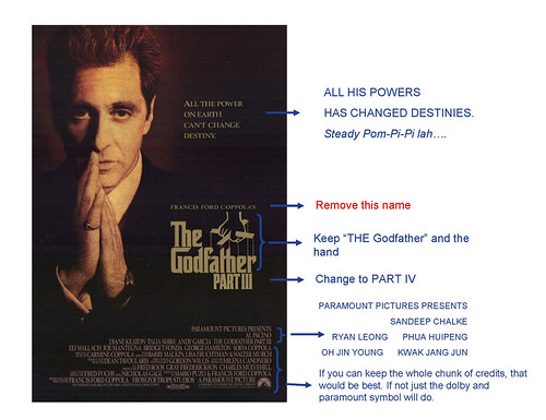
Can't do this in the caricature form, as he requested it to be done as portrait.
Not logical to write out every words with a black background.
Thus, I proposed to have the portrait drawn out in colour marker (to lower the cost), scan it into softcopy and do the necessary artwork and graphic layout in computer. When this is done, we will print this out as a poster and frame it up. He agreed.
However, the price will be higher, as more work was involved. Hence, he requested to do it with the white background, and black text, to cut down the cost.
But I told him that we won't be able to achieve the sombre feel of The Godfather III poster, when the background is white. Compare the following artwork with the movie poster. It is totally opposite. He thus agreed to stick close to the movie poster.
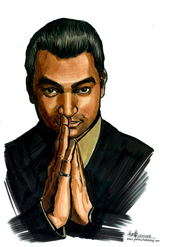
This is the original handdrawn artwork.
Scanned into softcopy.
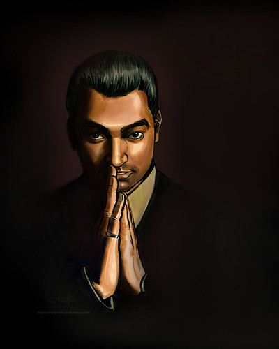
I increased the canvas size to easy manoeuvre later for graphic purposes. Added in the shadow on the face (with airbrush in Photoshop), to get close to the feel of the poster. Sprayed in the background colours. Now, we are almost there - this guy is in darkness now.
Cropped it according to the position and proportion as in the movie poster.
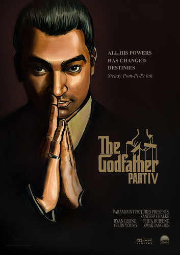
Edged out The Godfather logo. Took out the 2 'I"s, added in a 'V'.
Now, you see The Godfather Part IV.
Got the 'Dolby Digital' and 'Paramount' logo on Google Images. Edged out and changed to the colour as in the poster.
Didn't have the exact font as seen in the original text. The closest I can get was Times New Roman, but the proportion was too wide. After typing in, I have to rasterize and change their proportions.
I didn't put in the rest of the names, as they are not cleared, and not quoted in the price too.
Done! Quite a satisfying job.
My frame supplier thought it was a movie poster when I sent to him for framing.
Heehee..... I achieved the effect.
The client said "Amazing!" upon receiving the framed artwork. Now, he understood what I meant when I show him the original portrait and the done-up poster.
1 comment:
lovely work of art, i must say.
Just for records, try searching for a font called CORLEONE. It will give u the proper font, as well as the Pupeteer logo of Godfather.
Post a Comment