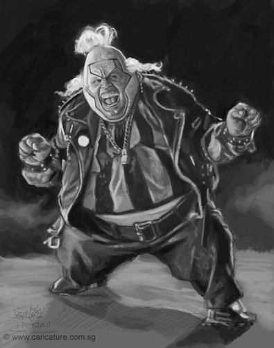
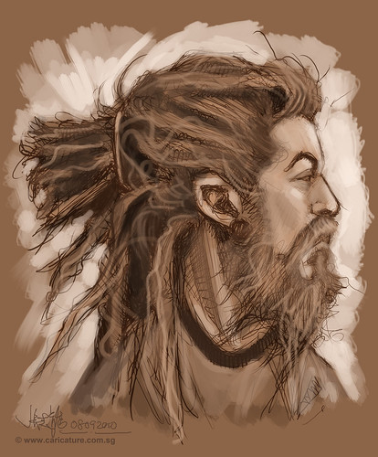
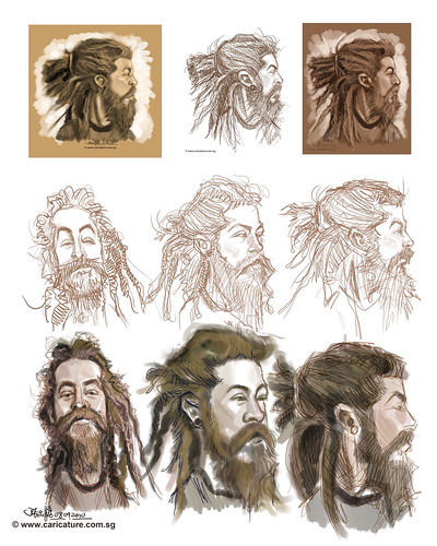
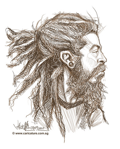
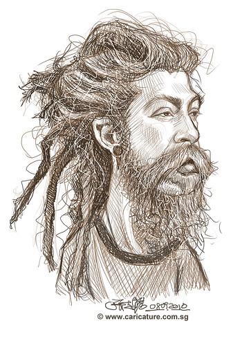
Continuation of previous assignment - illustration part 3.
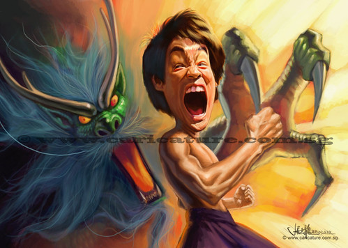
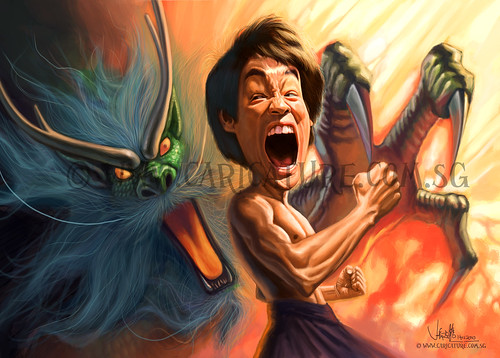
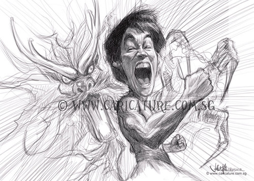
(The above 2 images were not posted in previous post.) Fine-tuned this illustration, based on Jason's critique.
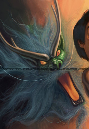
Tilted the angle of the dragon, and showed more of its claw.
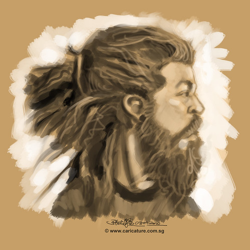
Pushed the hair details more. This part was fun.
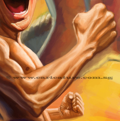
I had a hard time painting his arms, as I don't really have good reference photos of them.
I tried to figure them out by using my arms, together with some of his photos I get online, imagine the lighting, his veins and muscles.
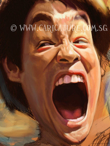
This was what I can do at this stage, with my current skill.
Hopefully, I can push myself further in the next painting of Bruce Lee.
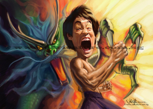
Personally, I think it looks better than my previous painting of Bruce Lee's caricature.
These 2 paintings showed how much I have learnt from Jason (Seiler's) Schoolism course - before and after.
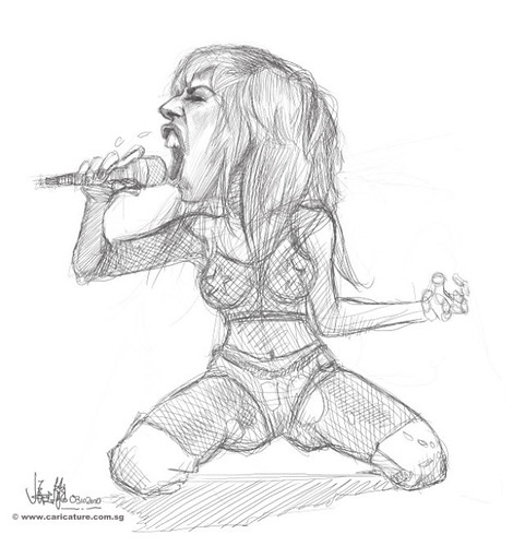
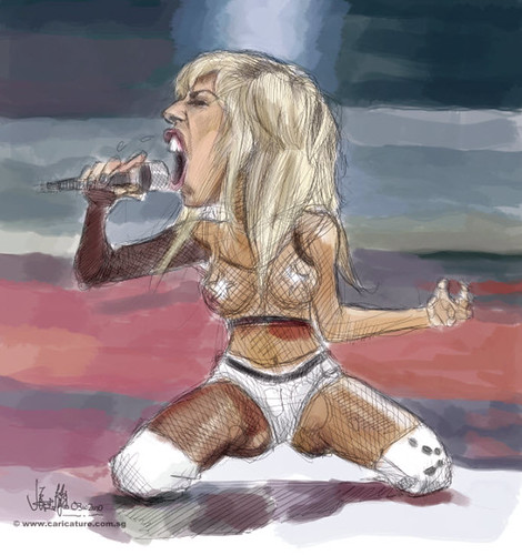
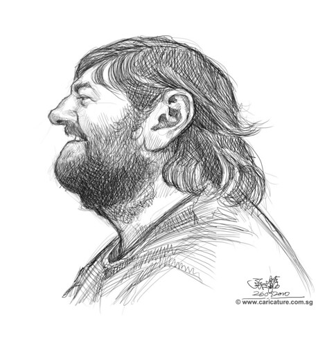
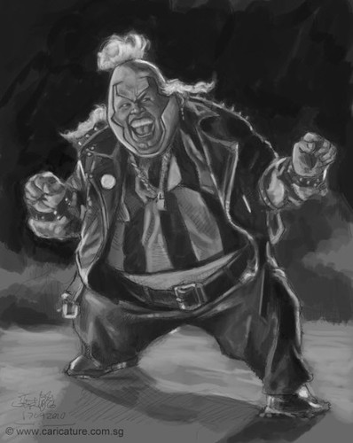
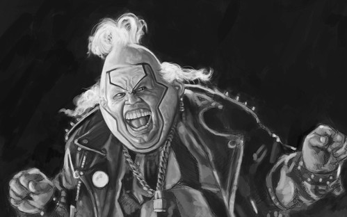
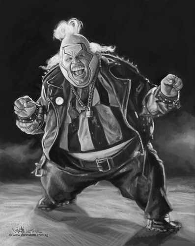
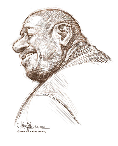
Another part of the assignment - celebrity caricature with full body posture.
I discarded the Lady Gaga caricature (not knowing that this subject will be used for the last 3 assignments of this course initially), and worked on this Bruce Lee caricature.
Anyway, I don't have much more to work on the former too.
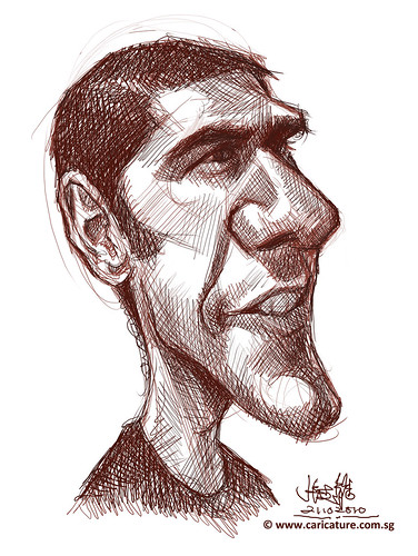
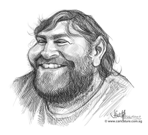
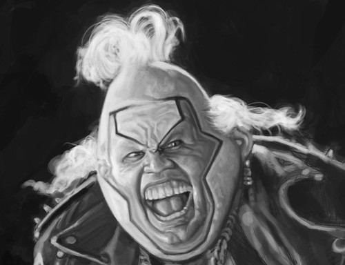
It was a lot more fun here. This expression was challenging. It doesn't have the usual look (the features, especially his eyes) of Bruce Lee. You can tell from the sketch above. It doesn't really showed his likeness, until I painted in the details. This is still work-in-progress, waiting for Jason's critique, before I work on it further.
Will update this in a later post.:)
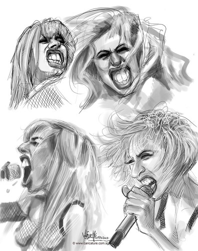
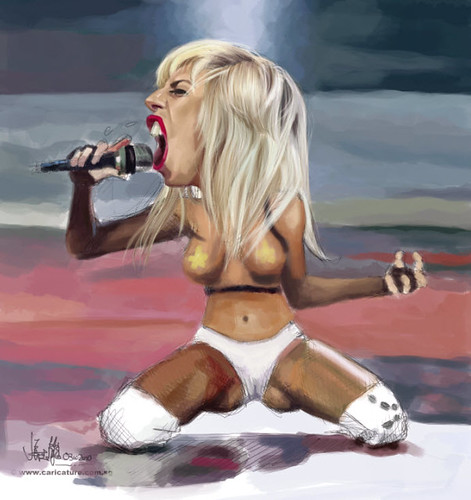
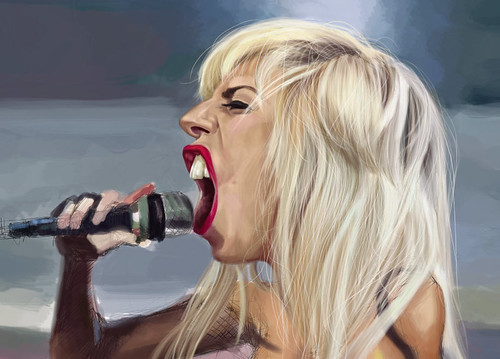
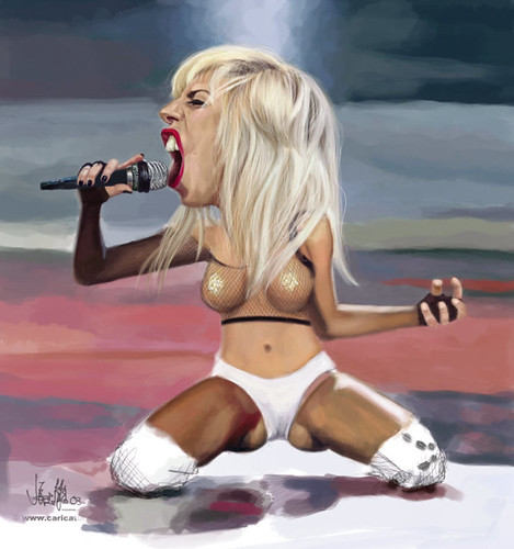
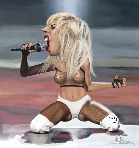
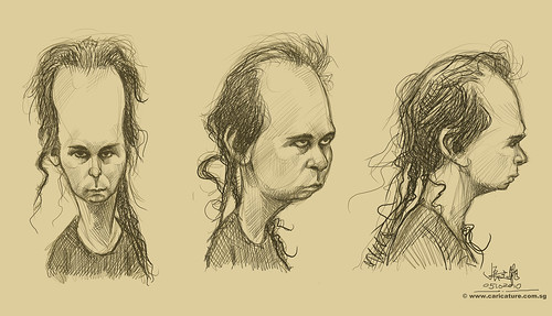
This celebrity caricature of Lady Gaga was for one of my Schoolism assignments.
I did some thumbnail sketch studies of her.face.
Sketching out the final one.
Colour scheme.
Painting over it.... Detailing her face and hair.... Finishingit!
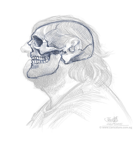
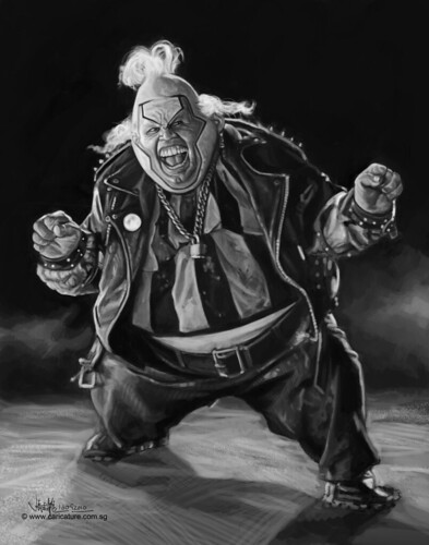
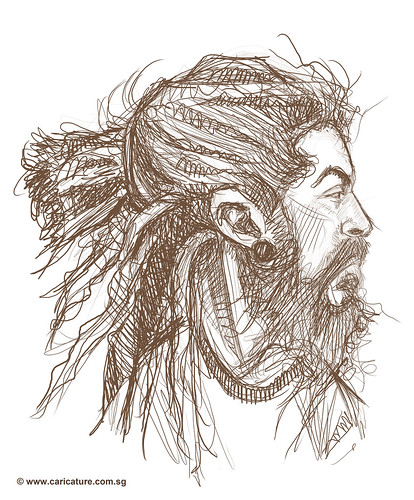
Sketch.... Blocking in the values in grey-scale......
Tightening and detailings.....Lots of details in this artwork...
The black and white value painting is done.
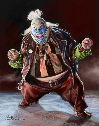
I painted over it with colours.... another painting technique (Grisaille technique) which I learned from Jason in Schoolism. I don't have enough time to include it in the assignment submitted. Thus, I tried it on this piece.
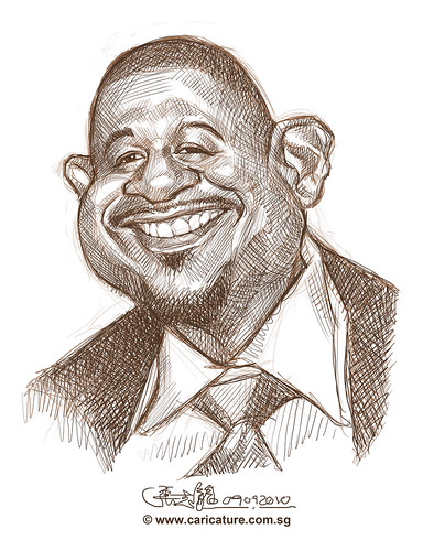
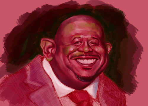
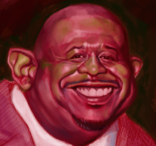
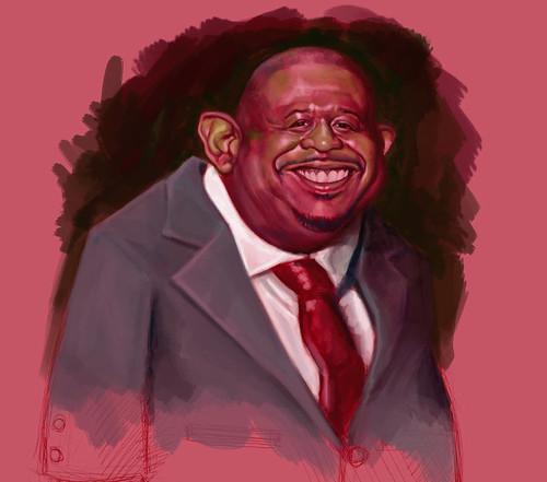
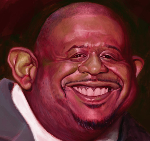
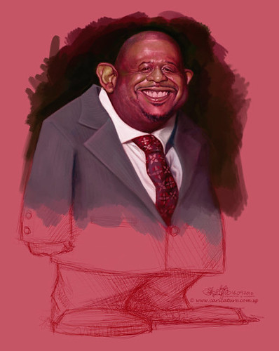
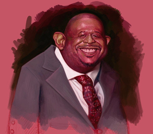
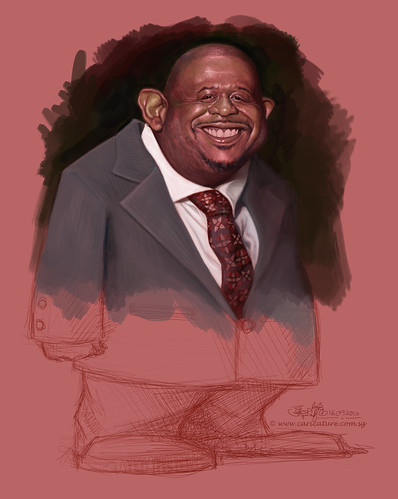
Using Split-Complementary Palette (combination of the maincolor with the two colors on either side of its complementary colour ) which I have just learnt, on Forest Whitaker.
I used red as my main colour, yellow green as my yellow, and blue green as my blue.
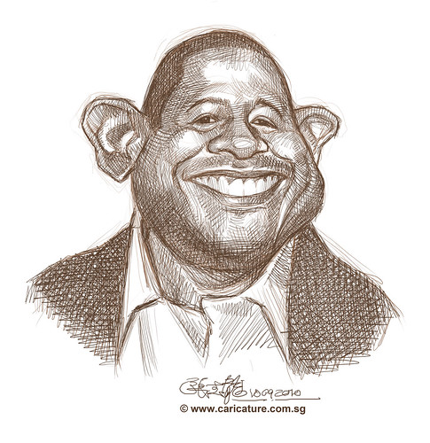
In this case, the palette will have limited colours, but the combination of these colours will be in harmony.
It is not meant to match the colours on the reference photo, but get close to it using the limited colour palette and colour temperature, and values.
I like the result. Split-Complementary palette is cool... and fun!