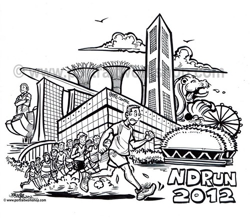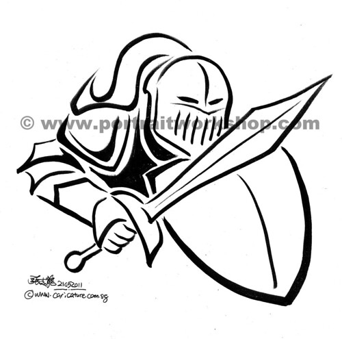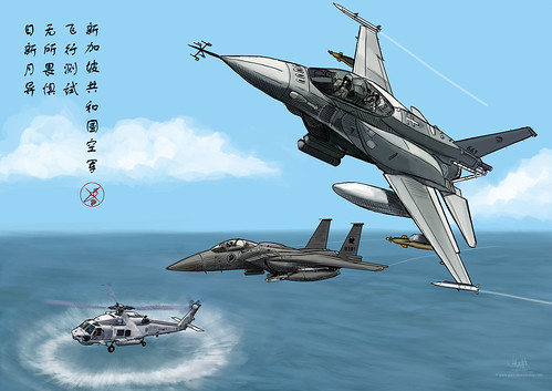
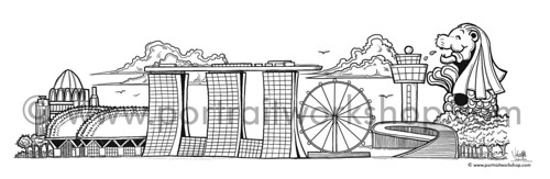
This was the mock-up the client sent me, based on my
template illustrations for the caricatures.
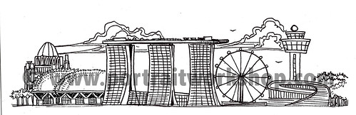
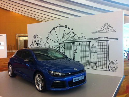
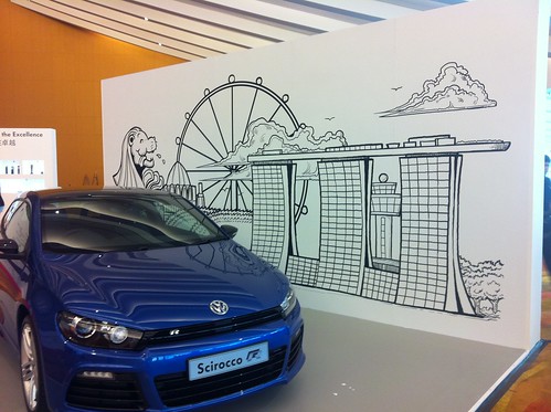
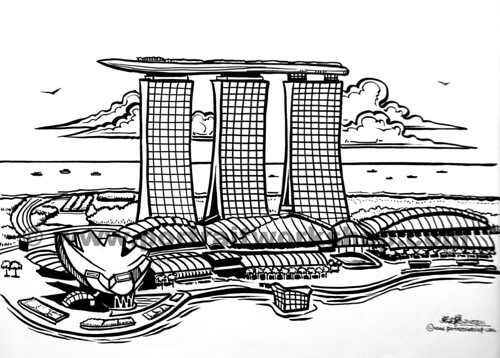
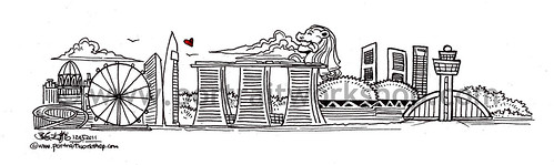
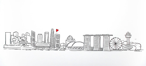
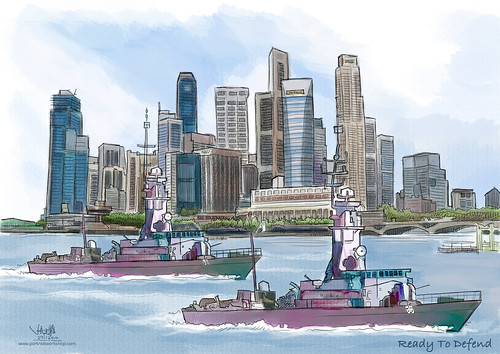
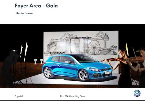
The client prefers the above skyline illustration, since the venue of the Volkswagen event
(
第九届大众进口汽车销售有限公司全国经销商大会
The 9th Dealer Conference of Volkswagen Import (China) Co., Ltd.)
will be held at Marina Bay Sands (MBS).
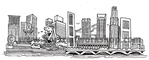
However, they wanted to include the Merlion (see below)
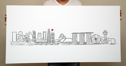
The backdrop is 6 meters by 3 meters.
The client initially requested to blow the caricature template, which was only 20cm in width.
The lines will look awful if it is blown up 20 times.
I have to illustrate it in vector file format.
The resolution would not be compromised, in this case.
I realized that there is a huge difference between illustrating a small size (like 50 cm) vs a 5 meters, on a 12' Cintiq. The line could appear straight when zoom out, but looks really crooked when zoom in at actual size. Thank goodness that I started with the canvas at the largest size possible in Macromedia Freehand of 5 meters in width. If not, I will have to re-drawn the whole illustration.
Unfortunately, I have left too much space on the top part. Once the car is place in front of the backdrop. most of the skylines were blocked.
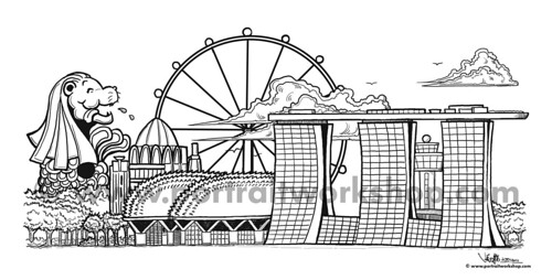
Thus, I have to pull them up, by enlarging and reshuffling the landmarks.
This took quite a long time, as I have to add in the white background for some of the landmarks like MBS. Thus, when the Changi Airport Control Tower was placed behind it, the MBS won't look transparent.
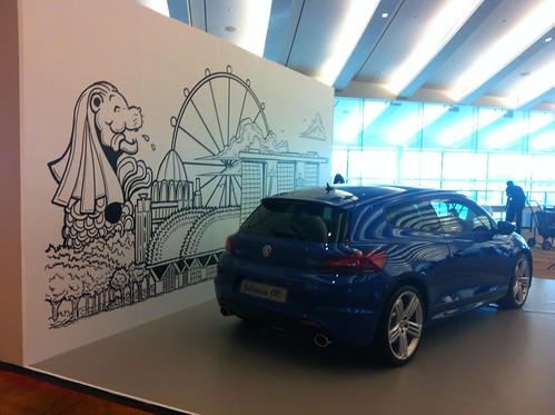
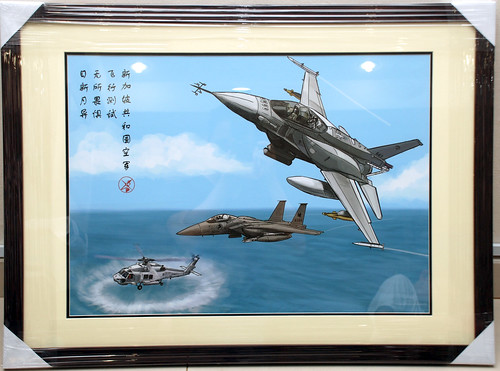
Some
snapshots of the backdrop illustration being printed out and installed on site, sent to me by my client.